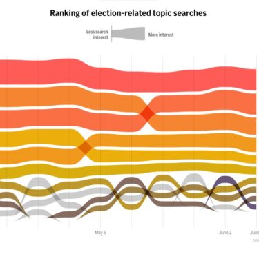
As November approaches, a key goal of the AP’s elections coverage is to reveal what issues are top of mind for voters. One reliable indicator of what Americans are concerned about is what they type into Google’s search bar. Over the past few months, the election graphics team worked with Google to retrieve search data on what we identified as key issues for voters. The team turned that data into beautiful, engaging data visualizations that tell the story of what Americans are searching for, available both for apnews.com readers and to our elections visuals licensing customers.
Building the Google Trends tracker was an interdisciplinary effort. Product engineer Pablo Barria Urenda set up a data pipeline to pull new data from Google each week, so that the tracker will live update through the rest of 2024. Maya Sweedler wrote the text accompanying the graphics and provided feedback throughout on topic selection and labeling. Humera Lodhi and Shelly Cheng designed and built two custom visualizations: a bump chart showing the changing rank of different search topics week to week, and state and county level maps showing geographic patterns of search interest. The team gave careful attention to labeling, legends, and scaling to make a complicated dataset easy for our audience to understand.
This project showcases the AP’s increasing capacity to go beyond traditional formats to tell data driven stories in a style that is modern, engaging and accessible.
For using well-presented data to help arm voters with key election year information, Cheng, Lodhi, Urenda and Sweedler win this week’s Best of AP — First Winner.
Visit AP.org to request a trial subscription to AP’s video, photo and text services.
For breaking news, visit apnews.com.


